Track Day Event
Scheduling Redesign
Redesigned Just Track It to deliver a differentiated, user-centered platform in a competitive track day market. I modernized the experience across web and mobile, improving navigation, usability, and accessibility for car enthusiasts at every skill level.
Role
Lead Product Designer · Design Architect · Researcher · AI Wizard
Methods
User Surveys · Competitive Analysis · User Personas · Journey Mapping · AI Prototyping
Timeline
6 Weeks
Impact
Modernized a legacy WordPress site into a clear, accessible, and mobile-friendly platform.

Problem
Just Track It was losing users before they ever registered. The site was outdated, impossible to navigate on mobile, and buried the most critical information users needed. New users couldn't even find how to sign up.
RESEARCH
Strategy
Earn the right to design by understanding the problem first. Research before wireframes. Structure before screens. Build something testable and validate every major decision with real users.
Reflections
Impact
A fully functional, user-tested redesign with intuitive navigation, track preparation tools, and an inclusive ladies events experience built and validated in 6 weeks.
Understanding the Users & the Market
The fastest way to design the wrong thing is to skip research. Before a single wireframe was drawn, I needed to understand exactly who was using Just Track It, what they were trying to accomplish, and where the experience was actively failing them. I approached this in two ways: talking directly to users through moderated interviews paired with a quantitative survey, and studying the competitive landscape to understand what the bar already looked like in this space.
Qualitative & Quantitive Research
I recruited 5 participants for moderated interviews: 3 existing Just Track It members and 2 who had never visited the site. That mix was intentional. Returning users reveal how people adapt to a broken experience over time. New users reveal what that experience actually costs.
The new users struggled immediately. Simple tasks like finding run group information or event requirements became lengthy, frustrating searches. The registration flow was the clearest failure point: clicking on an event handed users off to a third-party scheduling screen buried at the bottom of the page, with no indication that they were in the right place or what to do next. Both first-time users stopped and asked if they were still on the Just Track It site. That moment of confusion is exactly the kind of thing you only see when you watch someone use a product for the first time.
The existing members had learned to work around the site's limitations, but that didn't mean the problems weren't there. Even among this group, the pricing table created consistent confusion. The "Other Options" row left users unsure whether it was an add-on or part of standard registration. When experienced users still can't interpret core information, the problem is structural.
One finding was unanimous across all 5 participants: every single user wanted access to track maps or walkthrough videos before arriving at an event. It was the clearest signal of the entire research phase, and it directly shaped one of the most impactful features of the redesign. With those insights documented, I had enough to build a clear picture of who I was designing for.


User Persona
Research gives you data. Personas give you someone to design for. Using the interview findings, survey responses, and my firsthand knowledge of the motorsports community, I built three personas representing the core segments of the Just Track It audience: the novice driver who is nervous and needs guidance, the seasoned driver who values efficiency and clear information, and the instructor managing multiple events and responsibilities at once. These weren't decorative artifacts. They became the filter I used throughout every design decision when I was unsure about a tradeoff, I asked which persona it was serving and why.

Competitive Analysis
Understanding users only gets you halfway there. You also need to understand the market they exist in. I audited the two primary competitors in the track day space, CHIN Track Days and Porsche Club of America, looking specifically at navigation clarity, content organization, mobile experience, and inclusivity. Users in this community don't just compare Just Track It to itself. They compare it to every other site they've used, and that bar matters.
The findings were revealing. Both competitors had cleaner navigation and stronger visual hierarchy than Just Track It, giving them a meaningful advantage in first impressions. But neither had fully solved for accessibility or cognitive load, and neither had made a meaningful effort to speak to underrepresented communities in motorsports. That was the opening. Just Track It had the opportunity to leapfrog both competitors not just by catching up on the basics, but by building something more inclusive and more user-centered than anything currently in the market. The research had told me what users needed. The competitive analysis told me how far the bar had to move. It was time to start building.

Ideation
Lo-Fi Prototyping & Brainstorming
With research complete and the problem clearly defined, I moved into ideation — but not into Figma. One of the most valuable habits I've built as a designer is staying lo-fi as long as possible. Sketching on paper forces you to think about structure and logic without getting distracted by color, type, or component choices. It's where the real design thinking happens.
From Insights to Structure
Three questions guided this phase: How do we organize the navigation so users can find things without thinking? Where does each piece of content belong relative to what users are actually trying to do? And how do we guide someone who has never heard of Just Track It from landing on the homepage to confidently registering for their first event? Those questions became the filter for every layout decision.
I explored multiple homepage layouts, experimenting with how to lead with upcoming events, establish the JTI brand quickly, and create clear paths for both first time visitors and returning members. The wireframe below is the direction that best answered those questions: a hero with a singular, clear call to action, an event section built around structured cards, and a community section to build credibility for users who weren't ready to commit yet.
The sketching process kept surfacing the same underlying question: where does each piece of content actually belong, and how do users mentally expect to find it? That question deserved a deliberate, structured answer not a gut feeling. Before moving into high-fidelity design, I needed to formally work through the information architecture.
IDEATION
I started by mapping everything the original site contained. Nine top level navigation items: Home, Calendar of Events, Higher Performance Driving, Referral Program, Subscribe, Track Pass, Instructor Information, Our Partners, Contact Us, and Gift Card. Every item carried the same visual weight, which meant nothing stood out and users had no way to prioritize. I also flagged content that existed on the site but was effectively invisible event requirements, run group descriptions, and safety information were all present but buried deep enough that users consistently missed them during research sessions.
With the full inventory mapped, I cross-referenced every piece of content against what the research had told me users actually needed. For each item, I asked two questions: does this serve a real user need, and where would a user intuitively look for it? Content that had clear user value was kept and repositioned. Content that existed primarily for internal organizational reasons, without a meaningful user benefit, was flagged for consolidation or removal. Insights from the competitive audit helped me validate which categories users in this space consistently expect to find, which made it easier to identify what was essential versus what was just taking up space.
Prioritization
DESIGN
Lo-fi wireframe exploring homepage layout, content hierarchy, and navigation structure
Structuring the Navigation
Navigation is often where products quietly lose users. If someone can't find what they're looking for within a few seconds, they don't dig deeper they leave. The original Just Track It site had nine top level navigation items with no grouping, no hierarchy, and no clear starting point. Fixing that required more than visual cleanup. It required understanding what users actually needed to find and reorganizing the entire content structure around their mental model, not the site's existing one. I worked through this in three steps.
Content Inventory
Content Audit
With a refined content set, I grouped related items into logical categories based on how users think about them, not how the business had historically organized them. Content fell naturally into four buckets: event-related content, programs and community features, educational and preparation resources, and company information. That grouping became the foundation for a new navigation structure that went from nine items down to five:

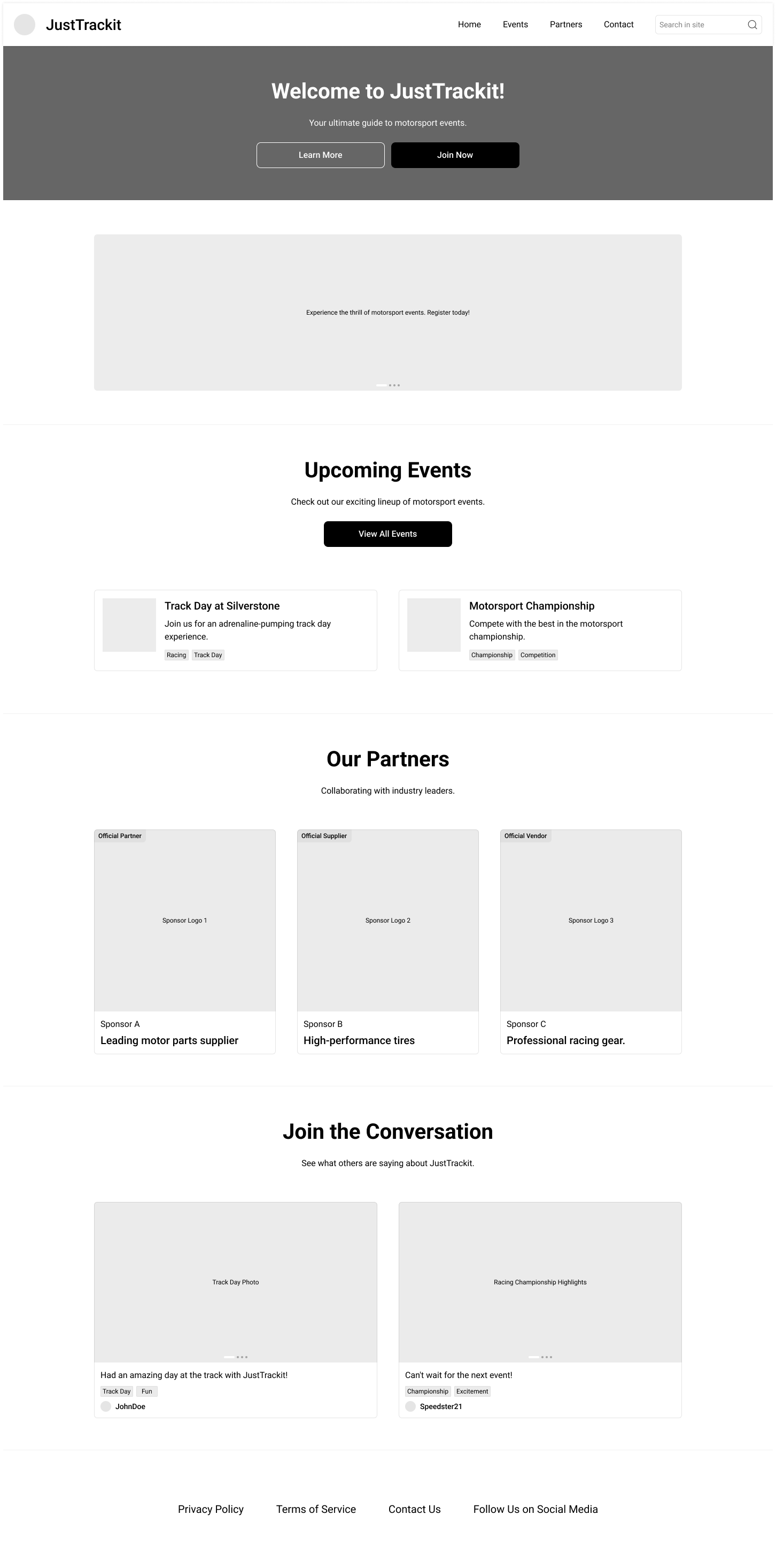
Five nav items instead of nine. That reduction wasn't arbitrary every item that was removed either found a better home or was deprioritized based on user need. The Ladies Track Day page, which users consistently reached for under Programs during research sessions, was placed exactly where they expected it. Subscribe was pulled from the nav entirely and woven contextually into the pages where it actually made sense. The result was a structure users could navigate by intent, not by guessing. With that foundation in place, I could finally move into high-fidelity design knowing every decision had a reason behind it.
Redesign & Problem Solving
With the structure defined and user needs clearly mapped, I moved into high-fidelity design. This phase is where research pays off. Every decision had a reason, every feature traced back to something a real user had told me. I wasn't guessing at what might improve the experience I was building the specific things the research had already validated as missing.
Navigation & Layout
The before state said everything. Nine navigation items competing for attention, no visual hierarchy, and an event scheduling page dense with tables, fees, and fine print that gave users no clear signal about where to look or what to do next. For a new user arriving on this site for the first time, the experience was overwhelming and the research had confirmed that many of them simply gave up.
The redesigned navigation put the most important actions front and center, eliminated the noise, and gave users a clear path from any entry point to their goal. The event pages were rebuilt from the ground up: key details surfaced at the top, visual hierarchy restored, and registration made obvious instead of buried. Screenshots of the original experience are included below as a reference point for how far the design moved.

Track Guide
All users interviewed said they wanted to see and watch a track guide to help prep for the weekend. For novice drivers especially, arriving at a circuit without knowing the layout creates anxiety that takes away from the experience before it even begins. This was one of the clearest, most actionable pieces of feedback from the entire research phase, and the design response was direct: track guide videos embedded on every event detail page, so drivers can study the circuit ahead of time and arrive with confidence instead of uncertainty.

Ladies Track day Events
Static mockups can only take you so far. To truly validate the design, I needed something users could actually interact with. I used Claude Code to build a fully functional HTML, CSS, and JavaScript prototype complete with real navigation, a shop, cart functionality, checkout flow, and event scheduling pages. This wasn't a simulated click through it was a working product that users could explore freely without being guided through a scripted path.
Building a functional prototype at this stage changed the quality of the feedback I was able to gather. Users behaved naturally because the experience felt real. That authenticity made the usability testing sessions significantly more valuable than they would have been with a Figma prototype, and it gave me the confidence to move into testing knowing I was evaluating the actual experience, not a representation of it.

USABILITY TESTING
Design is a hypothesis until users validate it. I brought the same participants back for a second round of testing, this time on the redesigned prototype. The goal was simple but important: did the decisions made throughout research, IA, and design actually solve the problems users had walked in with six weeks earlier?
What was tested
Testing the Prototype
The task set was built directly from the failure points uncovered in round one. Finding run group information. Locating event requirements. Navigating to the Ladies Track Day section. Completing a registration flow from start to finish without assistance. These were the exact scenarios where the original site had let users down, and they became the benchmark for measuring whether the redesign had moved the needle.
Because the prototype was built in HTML, CSS, and JavaScript, users could navigate freely, interact with dropdowns, and move through the registration flow the way it was designed to work. There was no need to explain what was "clickable" or guide users through a scripted path. They explored on their own terms, which is exactly how you get honest feedback.
What I learned
The improvement was clear. Both new users — the same participants who had struggled to find basic information on the original site completed every task without assistance. The registration flow, which had been the single biggest failure point in the first round, was no longer a source of confusion. With the call to action surfaced prominently on the event page and the third-party handoff clearly signposted, neither user hesitated or asked if they were in the right place.
The returning members noticed the difference immediately. The streamlined navigation reduced the mental overhead they had quietly adapted to over years of using the old site, and several commented that the new structure would have made their very first visit significantly easier. That kind of feedback from experienced users is meaningful it means the design isn't just better for beginners. It's better for everyone.
Testing also surfaced two clear priorities for the next iteration: users wanted more prominent visibility of track guide videos on the event cards themselves rather than only on the detail page, and one participant flagged a need for clearer confirmation messaging after completing registration. Both were documented and added to the design backlog. The research loop was complete real problems identified, intentional solutions designed, and meaningful improvement validated by the same users who had revealed the gaps from the start.
OUTCOMES
Impact & Outcomes
Not every feature request from users made it into this iteration, and that was a deliberate product decision. Good design is about solving the most important problems well, not building everything at once. What was delivered in six weeks meaningfully changed the experience for every user type the research had surfaced.
Users could find what they were looking for without assistance, on the first try. The navigation finally reflected how users think about the content rather than how the business had historically organized it. And the track preparation tools generated the most enthusiastic response of the entire testing process users expressed genuine excitement when they discovered track guide videos on the event pages, with several noting that having that information before arriving at a track weekend would change how they show up on the day. That reaction is what good design feels like from the user's side: not just useful, but thoughtful. A product that clearly had them in mind.

This project is a case study in why process matters. Six weeks from problem to functional, user tested prototype is a fast runway — and the only reason it worked was because the early investment in research gave every subsequent decision a foundation to stand on. When you know what users actually need, you don't waste time designing the wrong things.
One of the more technically interesting challenges was connecting Claude Code to the Figma design library I had built for Just Track It. Getting the two to work together so that the prototype reflected the actual design language rather than defaulting to generic styles required learning how to bridge design intent and code output in a way I hadn't done before. The result was a prototype that felt like a real product because it was grounded in real design decisions, not a placeholder.
That experience also deepened a conviction I hold strongly as a designer: AI tools do not replace the design process, and they shouldn't. The wireframes mattered. The IA work mattered. The structured thinking that happened before a single line of code was written is what made the prototype meaningful. AI accelerates execution, but it doesn't do the design thinking. The decisions about what to build, how to organize it, and why it serves the user those still require a designer who has done the work to earn them.
I'm still learning how to use these tools effectively, and I treat that as an ongoing practice. I continue to explore new tools, test how they fit into my workflow, and stay curious about what they can and cannot do. This project pushed me to grow in that space, and it reinforced why I believe the future belongs to designers who understand both sides of the equation.